Vitti
Vitti, a tea finding app allows users to discover new flavours of tea and find which stores carry them in the city, all in one centralized location.

The process
The concept for this app started off with my love for tea. I was discussing tea with a friend of mine one evening and came up with the concept for Vitti. I realized that there was a strong tea community and an awareness of health benefits associated with drinking tea.
Problem Statement: Tea drinkers not having quick access and information to the types of teas that cater to their interest.
The solution was to design a tea app that catered to seasoned tea drinkers and well as newbies by which they could search tea types by their favourite ingredient or tea base and locate it in the city, look at user ratings, read reviews, write reviews, find out the price and get more information on tea that will eventually build a greater tea community in the city.

After coming up with the Design Brief, I started to consider how I would conduct my user research and the questions I could ask them. I decided to interview six tea drinkers and ask them the questions below:
- What types of teas do you like?
- Why do you drink tea?
- Where do you usually buy your tea from and why?
- Do you like trying out new teas? If so, what kinds and why?
- Are there any types of teas you have bought and did like? Why?
- How do you manage to remember the types of teas your have tried and liked?
- Do you take recommendations into consideration when making your next tea purchase?
- Do you use Google or another search engine to search for new teas?
- How do you find out about new flavours of teas out there?
- Do you have subscriptions to any tea stores?
- How often do you buy tea?
- Do you have any strong habits around drinking tea?
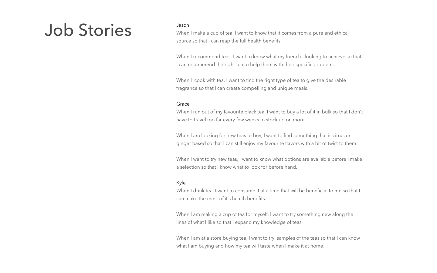
I allowed to conversation to be organic and less structured to allow the users to feel relaxed. This way, I was able to capture their candid responses and not have them think what should be the ideal response to the question at hand. After I had finished the user interviews, I had noticed overlaps and a pattern amongst the users. I merged the common personas together and came up with three main personas below.


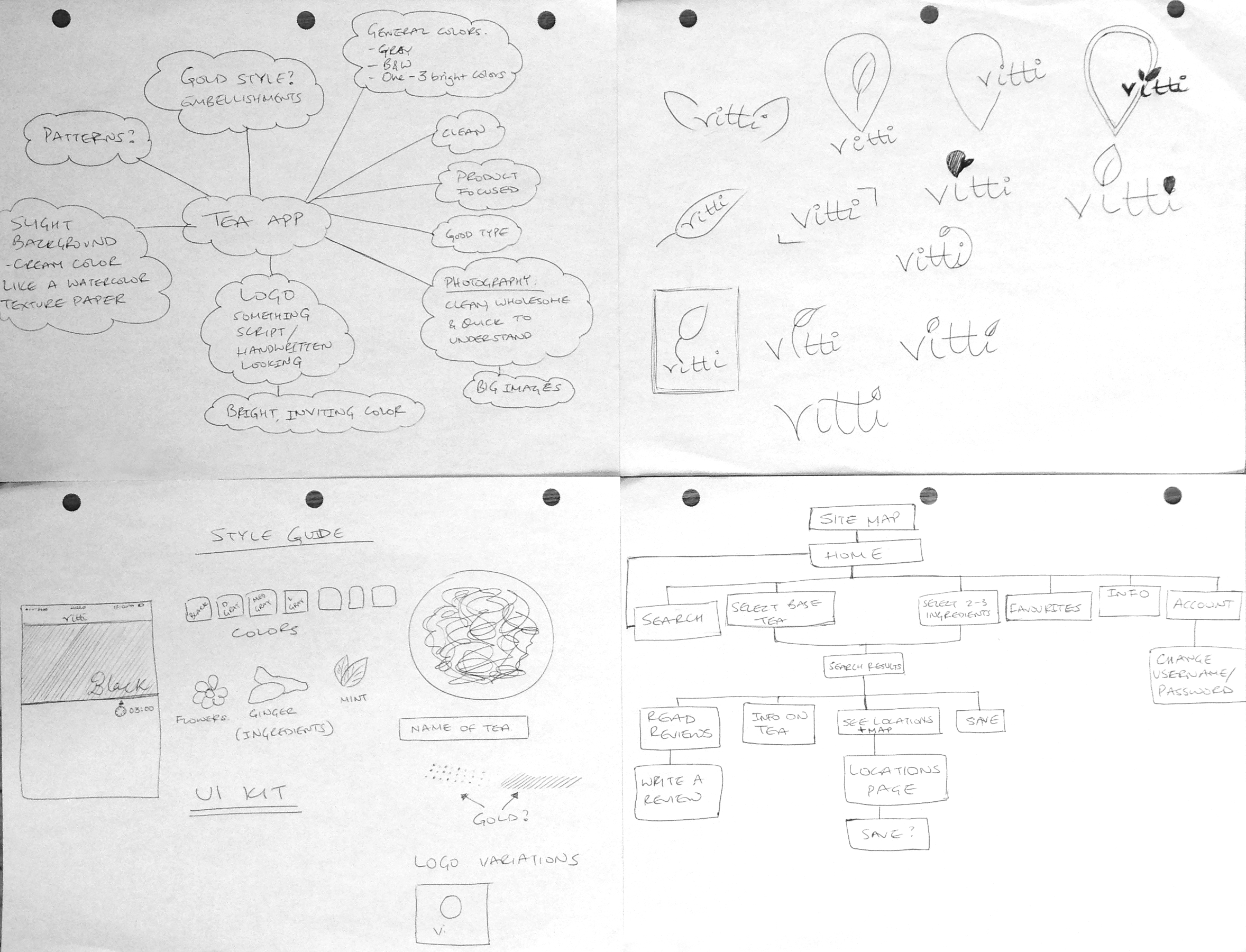
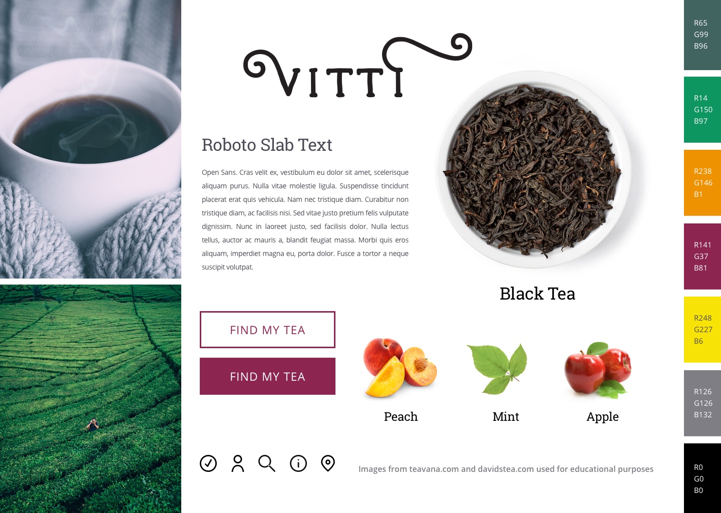
Once I was able to create the job stories, I had a better understanding of tea drinkers and their habits. The next step was to come up with a style tile that would shape the look and feel of the tea app. One thing I knew for sure was that I wanted the app to have a very clean look to it. I did a lot of research on current tea stores and how they position their brand. The two big stores that stood out to me were Teavana and David's Tea. I started to look for clean images of teas on the internet and tried to find consistent images but was unable to do so without paying $350.00 for them. Thus, I decided that I would take images from Teavana and David's Tea and give them credit since it is a project for educational purposes. I also started writing down my thoughts and ideas for a logo.


I started to think about how the user would navigate through the app and mapped out some of the user flows.

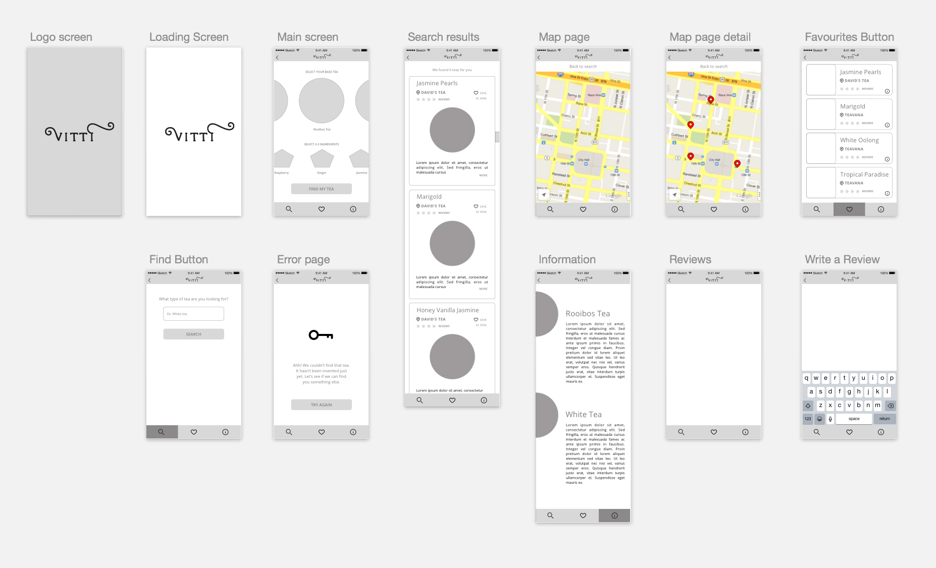
I started to create low fidelity wireframes to see how the layout would look and be able to tweak the design at this stage after starting my first round of user testing so that I could fail quickly and effectively.

After doing my first round of user testing, I found that the users didn't understand what the icons stood for at the bottom and having text under them would help considerably. The search page didn't prove to be too helpful since users didn't know that they could also search by a tea name and not just type. The information page layout wasn't compelling to give users the option to look at the different tea types at one shot as opposed to scrolling down. I worked on another iteration, incorporated user feedback which I eventually tested once again, before achieving the final prototype below.